Post
by shushens » 13 Sep 2009, 01:22
You are welcome!
If you really want criticism, there are a few things I can see.
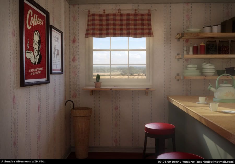
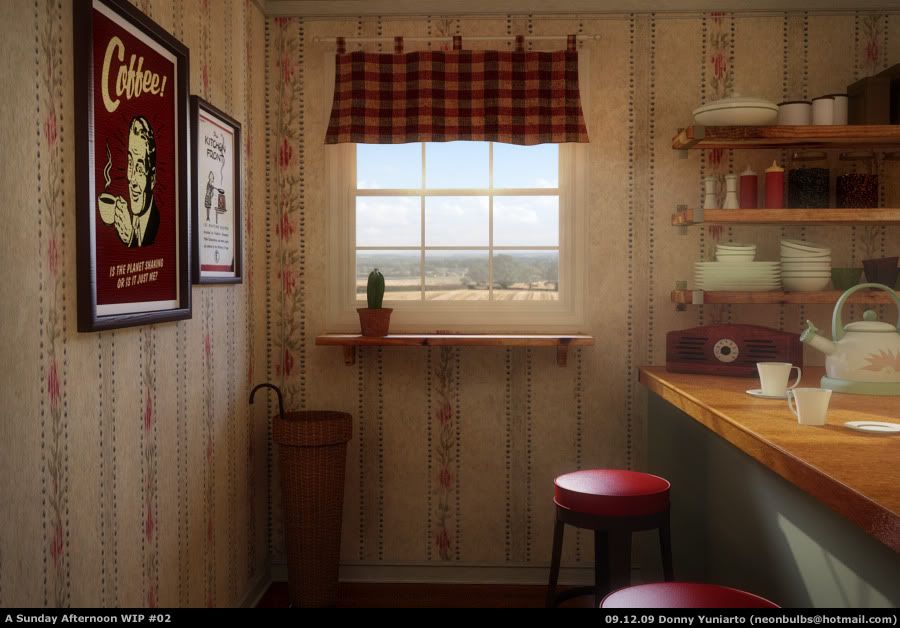
1, The Coffee ad is 100% non-reflective, which is not natural. Usually those things do not have a glass covering, but the paper must be a tiny bit glossy.
2, The seats on the barstools are too perfect to be real. They need more wrinkles, a little weathering by the corner edges.
3, The pot with the cactus is too small and there should be some scattering on the pot. It's looking like it's a square object. But it is not. So some light should bleed in by the boundaries.
4, The plates on the bar are too thin. They're almost zero-thickness.
5, The window-curtain is not enough translucent. It looks like it's made of some thick fabric. In that case you have to use some noise texture to drive the translucency, because it won't be uniform like it could be for fine silk.