Hi, no prob!

And great that there is a sandbox (of what was the sandbox just a few days ago

)
Also, the media portals now all seem to work at least on my end,
... and just by curiosity, can the default media portal size be resized?
it feels like they are still made for when the frame ratio was 3/4 (of high height) and on smaller screens.
If easily resizable, I would give them a good 1.5x resize.
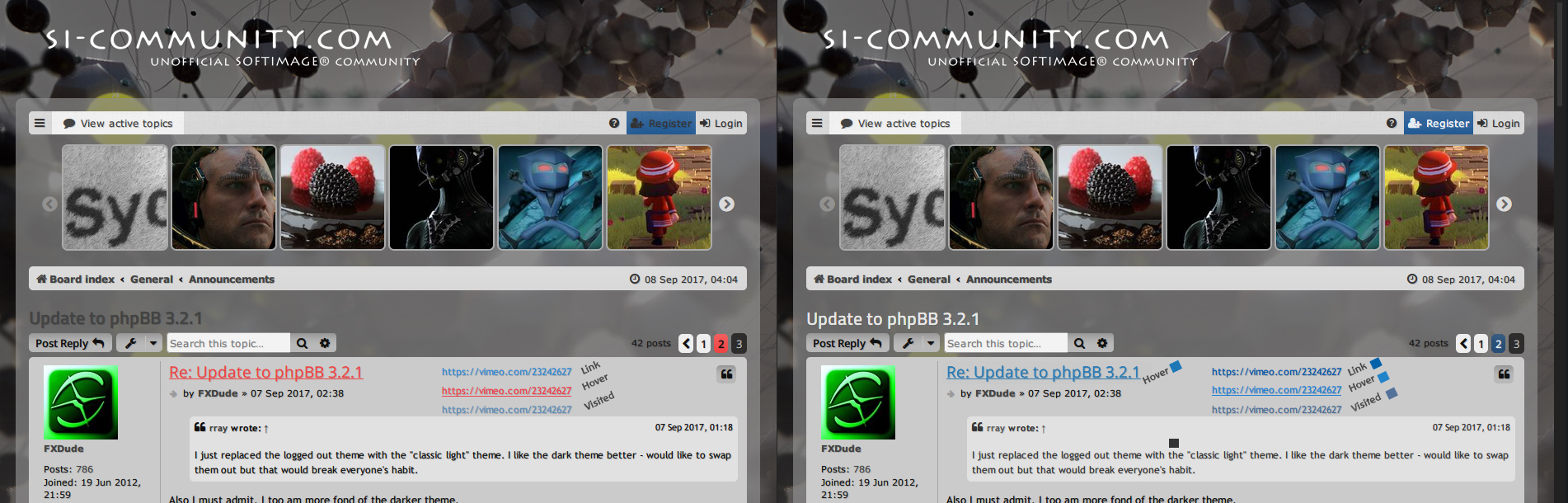
For the colors,
everything seems great! Unified button colors and all ! ;;)
Except .. I think that you perhaps inversed the link colors?
They were initially determined by best contrast/clarity in their non-hovered states
(while still remaining distinct enough from regular text),
or meaning (for the light theme), a darker teal (on light gray) of non-hovered links,
and a perhaps less contrasty, but still clear "your mouse is over the link" brighter teal on hover.
But when logging-in, I saw that this reversal looks best with the dark theme,
because it means more contrast of the non-hovered brighter teal over dark gray.
( which could very well have inticed the reversal )
So if link colors of both light and dark themes refer to the same link colors,
I would agree that how it is now, is a good compromise for both.
But if both light and dark themes have their own link colors,
I would swap the unhovered<->hover colors for the light theme links.
Then I won't bother you with colors
Cheers, and great to have you at the helm!