


Industrial Space

Re: Industrial Space
There's too much "noise" there. I really do not understand what's going on in there. Maybe a clay shader render would better reveal the shapes and details.
The society that separates its scholars from its warriors will have its thinking done by cowards and its fighting done by fools.
-Thucydides
-Thucydides
-
Falam
Re: Industrial Space
What do you mean by 'noise' ? The materials have changed drastically since that image if that is what you mean ?

Re: Industrial Space
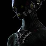
Looks alright, is it a corridor? Looks like there is a lot of chrome all over the place.
-
Falam
Re: Industrial Space
Yes it is a corridor. As I said the materials have been changed to make it 'better'Draise wrote:Looks alright, is it a corridor? Looks like there is a lot of chrome all over the place.
Re: Industrial Space
The concept is good, but I think the trusses you have repeated many times is a bit too much. If you have half as many, it will still look detailed but not overbearing, unless that is part of the machinery? Looking forward to the future updates. ;)
Re: Industrial Space
You should ask yourself what you want to depict. Do you think that others will get through to your intentions? It's not about a noisy texture, but a nosiy image. And I'm not talking about grain here.
In case this is a technical illusration it fails in this cropping as it lacks any clear visual intention or description. I don't get any sense of the form, space, funtionallity of the object. Total visual confusion. One doesn't get what it is about.
In case it is just an image, even an abstract one, it fails for me too currently, as it neither attracts the eye to watch it for a longer period or presents an interesting abstract form which is enjoyable. I don't know if this is just a portion of the complete image, but at this point it needs either a lot of work or one should abandon it.
Before you start in 3d, you should make sketches of your ideas and you should know, what you want to achieve. This rendering looks more a modeling process which developed further, but currently got stuck. One feels that you aren't 100% sure what you want to go for.
Cheers
-
Falam
Re: Industrial Space
I know what I want to go for, the materials and the image have been changed so have the materials. At the time it was a WIP.Pancho wrote:You should ask yourself what you want to depict. Do you think that others will get through to your intentions? It's not about a noisy texture, but a nosiy image. And I'm not talking about grain here.
In case this is a technical illusration it fails in this cropping as it lacks any clear visual intention or description. I don't get any sense of the form, space, funtionallity of the object. Total visual confusion. One doesn't get what it is about.
In case it is just an image, even an abstract one, it fails for me too currently, as it neither attracts the eye to watch it for a longer period or presents an interesting abstract form which is enjoyable. I don't know if this is just a portion of the complete image, but at this point it needs either a lot of work or one should abandon it.
Before you start in 3d, you should make sketches of your ideas and you should know, what you want to achieve. This rendering looks more a modeling process which developed further, but currently got stuck. One feels that you aren't 100% sure what you want to go for.
Cheers
-
Falam
Re: Industrial Space
It's all part of the machinery, I understand your point, I removed some detail then it looked 'bland', I tinkered with the image and adding and took things away, numerous times, if I took to much away I lost the effect, I wanted, then someone on this forum would say 'it looks too bland'. I'll update as it gets closer to finished, it's part of a larger compositionDraise wrote:The concept is good, but I think the trusses you have repeated many times is a bit too much. If you have half as many, it will still look detailed but not overbearing, unless that is part of the machinery? Looking forward to the future updates. ;)
-
Falam
Re: Industrial Space
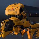
Here is a shot of the parts inside the corridor; some parts I'm going to ignore, most areas are textured 

Re: Industrial Space
The textures are looking MUCH better! Good work. =)

Re: Industrial Space
Hi,
I like where it's going, it looks like it could be a bit a hallway in Thor's realm in space.
But an inherent difficulty in 3D,
is that by default all objects are somewhat independent from each other..
So the challenge is to give as much depth and volume as possible to make everything look more there.
You could start by making your light sources more clearly defined in your environment,
perhaps have like larger neon-backlit-frosted-glass-light like surfaces
and position area lights in there,
or making the (area) ceiling lights larger, while killing any other lights that may be floating
.. all to get more variation of lit and dark areas,
a bit like what's happening on your back wall
but also affecting the pillars and supports.
Varing your textures on these support columns also might help avoid visual pattern repetition.
And you could also introduce Ambient Occlusion in your materials,
plugging-in whatever texture/color thats in your diffuse to the AO "Bright" port,
and in your case, perhaps a separate "Reflection" node, added (or in "screen") to that
and leaving the AO's "Dark" parameter black .
And then plugging this (ideally very wide) AO in your Illumination node's Ambient port,
so that the AO darkening would only affect areas not receiving any direct light,
and reflections on less exposed surfaces would be less pronounced as opposed to being constant.
Perhaps also giving a slight gloss to the reflections would help visually differentiate surface edges from reflected edges, making everthing less visually busy or reduce confusion.
And lastly , I think you have a very high normal poly smoothing setting on the lower bottom boxes
which can give spherical reflections/shading to flat objects.
Otherwise, I think it's a great start, and hope to see subsequent versions!
good luck
J

Re: Industrial Space
Looks good. Will this be the final lighting? What did you have in mind?
-
Falam
Re: Industrial Space
This is the final lighting, I'll be composting and AO pass, as long as it doesn't damage the look I'm going for which is in the right direction, you sound as if you have a suggestion.Draise wrote:Looks good. Will this be the final lighting? What did you have in mind?
Who is online
Users browsing this forum: No registered users and 48 guests